
CASE STUDY
Google Cloud Platform
Cloud Migration, Without the Headache
Following Google Cloud’s 2018 acquisition of Velostrata, I worked as the UX Designer on a small trio team bringing the technology into Google Cloud’s native experience.
UX Team
1 UX Lead | 1 UX Designer (me) | 1 UX Researcher
Timeline
4 months
Collaborators
Partnered daily with PM and Engineers


Overview
Velostrata dramatically reduced migration downtime, but early customers struggled to use it. The interface mirrored backend systems, relied heavily on documentation, and required constant support. I designed a fast-follow guided experience that turned a steep, error-prone process into a navigable, confidence-building workflow for IT administrators.
Impact
Doubled successful first-time migrations
23% reduction in setup and configuration time
68% decrease in reliance on external documentation
Team & Roles
UX Lead
Broke down the acquired system, its backend integrations, and feature set, translating them into clear briefs
My role
Designed the end-to-end interaction model and UI, focusing on reducing cognitive load and guiding users through complex, multi-system work
UX Researcher
Led usability studies and metrics, partnering closely with me through rapid iteration
Shipping Fast Without Burning Trust
Google wanted this high-profile acquisition live quickly. To meet timelines, the team shipped a bare-bones initial release that made migrations technically possible but leaned heavily on documentation and support.
I was concerned that this experience could lead to poor early impressions in technical circles. To mitigate that risk, we treated the initial launch as a functional foundation and publicly messaged a fast-follow guided UX already in progress.
That fast-follow release became my primary design focus.
The Problem
In early usability sessions, IT administrators consistently struggled with:
Complexity
Navigating between multiple screens and long technical documents
Integration
Understanding how off-platform configuration such as IAM and networking connected to in-product steps
System State
Knowing whether delays indicated failure or normal system behavior
Design Goals
For the fast-follow UX, we aligned on four goals
Simplify
Reduce cognitive load by limiting decisions per screen
Show
Make progress visible and predictable
Bundle
Shift from a server-by-server mindset to a workflow mindset
Guide
Replace documentation-driven work with guided interaction
Design Strategy
Making Complexity Navigable
I designed a guided, step-by-step experience layered on top of the existing system.
Key moves included
Minimal Tabs Open
Whenever possible, users stayed in a guided flow rather than jumping between settings, reinforcing an as-a-service mental model.
Choose-your-own-path Logic
Steps adapted based on the user’s environment, avoiding irrelevant configuration.
Pre-flight Clarity
Upfront checklists surfaced required permissions and information early, reducing mid-process stalls.
Inline Examples
Configuration guidance lived directly in the UI, minimizing documentation hunting.
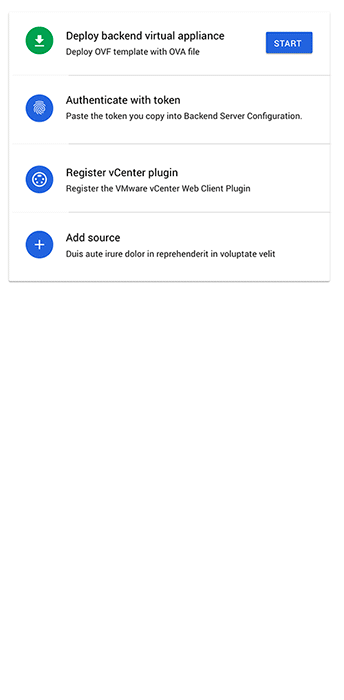
Stepper-based Workflow
The migration process unfolded one screen at a time, with explicit Next actions and confirmation checkpoints.
Workflow UX
From Servers to Migration Waves
A key shift was supporting migration waves rather than isolated server moves.
The UI emphasized
Indicators
Visual progress indicators across multiple migrations
Status
Health status and validation checks before cutover
Rollback
Clear rollback affordances that provided a psychological safety net
Research & Iteration
I observed usability studies live while our UX Researcher tracked metrics around task success, time-to-completion, and confidence.
Across iterations, we refined
1.
Step sequencing
2.
Terminology and mental models
3.
How much instruction to show
Over time, users moved from hesitation to fluency, completing migrations with less support and fewer errors.
THE LAUNCH
Outcomes
After launching the guided experience roughly two months after the initial release
Task completion time dropped by almost 25%
First-time success rates increased from below 35% to above 80%
Documentation reliance was cut in half
Admins reported dramatically higher confidence managing migration waves
Reflection
This project reinforced that complex systems don't always need to be simplified, but they do need to be legible
By pairing a minimal technical launch with a clearly signposted fast-follow UX, we met business pressure without permanently compromising user trust. Clear role boundaries, strong research partnership, and disciplined interaction design allowed us to move fast while delivering something durable.
Video Overview
I wrote, illustrated, and animated this (silent) video which was shared with the Cloud team right before launch to bring everyone up to speed with the basics of how the tool functioned. It does a good job covering the basics.
PRAISE
“Tucker Is awesome to work with, both a top-notch designer and human.”
UX LEAD ON THE PROJECT